While most regular users of Google Analytics are probably stuck in the reports of “audience” and “acquisition”, there are many other features that tend to go unnoticed. There are tools and functions that could completely transform the way you manage your digital presence. Today we bring you a list of those that you may not be so familiar.
#1 Plotting Individual Rows
One of the most recognizable elements of Google Analytics are probably the graphics displayed at the top of almost all reports.
There is a fairly simple and useful feature called “Plot Rows” If you mark at least one of the boxes on the left side of the table below the graph, and clicking the “Plot Rows” button located just above the table:
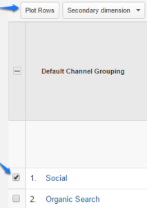
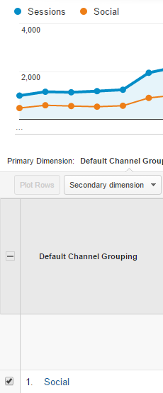
The selected rows will now be represented as individual graphics, and you can easily see the changes in values over time for each of these rows.
#2 Customize the Existing Standard Reports
Google Analytics offers a wide range of standard reports that can be accessed in just a few clicks. But sometimes you find that there is only one missing metric in the report. Instead of creating a new custom report from scratch, there is a small shortcut that allows you to arm a new report on one of the existing standard reports.
All you have to do is click on the “Customize” button on the top of the report you want to build. This will take you to the “Create custom report,” but with all existing and armed metrics and dimensions. Now you can quickly edit to suit your needs by adding the missing metrics.
#3 Intelligent Sorting With “Weighted Sort”
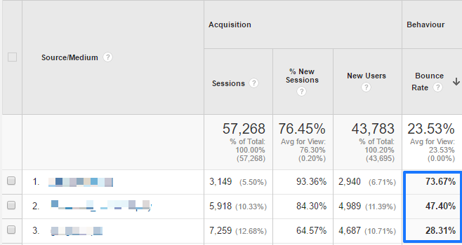
If you’ve ever ordered a report by bounce rate and you see nothing but the innings with a 100% bounce rate, you may have noticed that all these entries have only one visit. This is not helpful because improving bounce rates for these entries would not have a major impact on site performance.
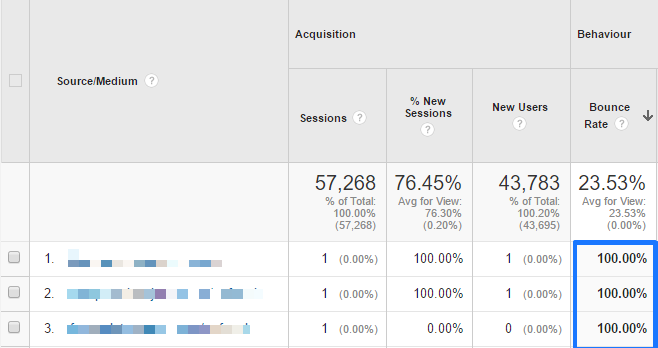
Luckily, Google introduced a new classification algorithm called “Weighted” in 2010.
This classification takes into account the number of visits for each row and shows the elements you should worry about. To activate it you need to sort the table by the percentage bounce (or other metric that uses percentages) and select “Weighted” in the drop-down menu next to “Sort Type”
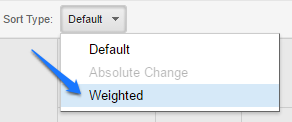
This will give you a report you can use, since any change in the sites listed in the top ranks will have a high impact on your business.
#4 Control the Number of Sessions Used to Calculate Reports
You may have noticed a notice in the upper right corner that says “This report is based on X sessions …” This notification is displayed when Google Analytics is filtering data due to high volume.
Sampling in Google Analytics occurs automatically when more than 500,000 sessions are collected for a report. This enables Google Analytics to generate reports more quickly for those large data sets. It can often occur when we apply segments or secondary dimensions to standard reports or we create custom reports.
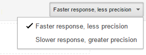
When you view a report, you can adjust the sample size for a faster and less accurate response or slower but more accurately. Just click the right button and select the option that fits your report.
#5 Define Your Own Custom Channels
Channel groupings is a very useful feature when it comes to putting together reports for clients. Analytics shows by default different types of traffic as “Organic”, “Direct”, “Social”, etc. But did you know that you can define your own channels? Simply go to “Admin” and select “Channel Grouping”.
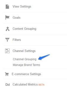
To begin you must click on the “New Channel Grouping”. Having appointed a new channel grouping, you get to set those channels. What channels you want to create and how you will define each of them will depend on the needs of your report.
Once finished, to access your custom channel grouping must go to report “Channels”. You have to click “Default Channel Grouping”. Then select the new group from the dropdown menu.

#6 Select Entire Months With One Click
This is a simple feature, but very nice, of the date range selector. When choosing a date range in the upper right corner, you can click directly on the name of the month and so will select the entire month!

#7 In-page Analytics
Get a glimpse of the actions they take your visitors with”In-Page Analytics” (Behavior – In-Page Analytics) This tool is very useful, because it lets you see what parts of the content attracted the attention of visitors and which parts are neglected. The information it provide helps to optimize the user experience.
By default, it displays the home page with basic metrics pages (page views, avg. time on page, etc.) as well as bubbles on all links. The bubbles show the percentage of clicks for each destination URL (clicks divided by page views). The clickthrough rate is for each landing page. Therefore, if you have four links that redirect the contact page, all show the same exact percentage even though it probably has a different number of clicks. This is one of the main limitations of this feature.
En la parte superior derecha de la ventana, están la opciones “Mostrar color” y “Tamaño del navegador”.
La opción de color resaltará todos los diferentes enlaces de la página, con la mayor cantidad clicks en rojo y la menor cantidad en azul. La opción tamaño del navegador mostrará lo que un cierto porcentaje de los visitantes ven. Cuando se arrastra el control deslizante en la parte superior, mostrara qué puede ver ese porcentaje en el sitio sin desplazarse.
At the top right of the window there are the options “Show color” and “Browser size”. Show color will highlight all the different links on the page, with the one with most clicks in red and in blue the least amount. The browser size option will show what a certain percentage of visitors see. When the slider at the top drags, it will show what that percentage of visitors see on the site without scrolling.
Do you know any other tool? You can mention it in the comments!


